Nov 19, 2011

Jack Cole's Playboy Style Cartoon Composition: A Guest Post by Timothy O'Neil


In 2007, blogger Timothy O'Neil published an astute visual analysis of one of Jack Cole's sexy "Jake" cartoons from the early 1950's. In another posting, I'll go more into the history of Cole's career as "Jake." For now, with Timothy's permission, I'd like to share his analysis with you (Thanks, Tim!). Timothy shared with me that this analysis of Jack Cole's composition took a lot of work, and it remains one of his favorite postings.

I've done a few of these visual analysis pieces myself, and I can attest to the fact that they are indeed, a lot of work and require a lot of looking and thinking. Tim's work here is well done and reveals the high level of craft and artistry that Jack Cole brought to his gag cartoon work. Tim concludes his visual essay with  a terrific point, that immediate accessibility is the major goal of most commercial artists. This is an overlooked, but important aspect to Jack Cole's art. His stories and gag cartoons are among the most immediately accessible work done in these mediums. A large part of that has to do with his mastery of composition.

Please be sure to visit Tim's blogs:

The Hurting
Rejected Breakfast Cereal Mascots

I'm happy to share with you this "guest post" on Jack Cole. If anyone else out there would like to write a guest post, please feel free to contact me.

LET'S TALK ABOUT COMPOSTION


This is a pin-up by Jack Cole ("Jake"), one of many produced for the Humorama line of mens' magazines in the years between his early comic book work on Plastic Man and The Spirit, and the Playboy work that defined the last period of his life. (This piece is excerpted from Fantagraphics' wonderful monograph, The Classic Pin-Up Art of Jack Cole, edited by Alex Chun and released in 2004. It doesn't actually contain any of his Playboy material, unfortunately. Fantagraphics and Playboy recently collaborated on an excellent overview of Eldon Dedini's pin-up art, so the idea of the two publishers one day producing such a volume isn't that far-fetched.)


First, let's look at the general shape of Cole's picture. I've used red to delineate the piece's main focus - a central oblong focal point roughly corresponding to the curves of the secretary's body and the faces of the men crowding the opposite end of the office. Notice how most of the straight lines in the composition are tangential to the area of negative space at the heart of the picture, defining the negative space without violating it. 


Something which surprised me was how the picture's sight-lines also framed the focal space. Look at how the direction of each figure's gaze also manages to do a great job of pointing the viewer towards where the artist wants the viewer to look. I've colored each character's plane of vision with a different colored triangle - you can see, roughly, that they all overlap at the center of the picture, in a pentagonal figure roughly corresponding to the composition I outlined above. 


Here, I have colored the picture's three main elements: the figure of the secretary in the center, the furniture in the middleground and the office spectators in the background. Notice how every shape in the picture defines the secretary's figure. The secretary really pops out of the foreground when set against the staid, perpendicular lines of the furniture and her co-workers.


By flipping the colors we see something else entirely: a band of light across the lower half of the picture, roughly corresponding to the ostensible focus point, i.e. the secretary's breasts, torso, hips and legs. In the real piece, obviously, this band of yellow is dark, which also helps to pull the eye down towards the desired focal point. The darkest point of a picture pulls the eye towards it - contrast is one of the illustrator's most potent tools. (This is why flat compositions can present difficulty in terms of immediate accessibility to the viewer. In the case of pin-ups, as well as posters, comic-book covers and album jackets, immediate accessibility is a major goal - if not the major goal - of the artist.)  


This post is copyright 2011 by Timothy O'Neil.

Nov 14, 2011

Jack Cole's Mystery Chicken Comics


Here's a tasty tidbit for all you fellow cooped-up comic book people who, like me are - unh - scratching around to uncover more Jack Cole comics. 

But first, I'll fatten up this lean posting with a chicken story!

I grew up in a semi-rurual setting, outside Baton Rouge, Louisiana. I had some pretty rural kinfolks that we stayed with from time to time. One morning, I woke up in an old farmhouse in Ponchatoula, Louisiana. I went out onto the big wooden front porch and peed into the yard. I said good morning to the fat old alligator in his fenced-in pond a few feet away. Yes, it was THAT rural -- maybe one reason I love Cole's hillbilly comics. Anyway, as I peed, the yard chickens came running up and hungrily pecked at the yellow droplets of urine as if they were corn! I'm not making this up!

That's when I realized that chickens, for all their great value in the food chain,  have rather flawed perception systems.

Jack Cole, however, had a pretty great sense of humor, and a huge love of comics, even when he - uh - winged it. Here's a one-pager from a feather-less (that is, cover-less) comic book that was probably packaged by Harry "A" Chesler, and most likely published by him, too. As usual for Cole, it's jam-packed with 5 one-panel gags and a 4-panel strip.The jokes are all pretty - unh - corny. 

We don't have a title or date for this one. My guess is it's around 1940. But really, at this point, we have no hen-ts to go on. At least, we can appreciate the sublime silliness of an entire page of chicken gags! It shows that Cole had a rather egg-zacting sense of humor:


The bottom strip is Jack Cole's own square egg comic book story, a concept that Carl Barks fully hatched years later in his classic "Plain Awful" square egg story ("Lost In The Andes, April 1949). And, lest you think I'm cracked in identifying this unsigned page of fowl humor to be by Jack Cole... one of the many tells is the patterned title lettering. This elaborate, distinctively-shaped lettering is similar to the title art from the last story in Plastic Man #2 ("Coroner's Corners", circa 1944). Here's that unforgettable splash page, for comparison:


I guess that's why we love the man's work: it's pretty -- clucked up -- in a beautiful way.

ANNOUNCEMENT! My two Midnight ebook collections, Volumes 1 and 2 are on sale for only $2.99! See the right-hand sidebar (or click "web view" if you are browsing on a mobile phone). Buy today for -- cough, cough -- chickenfeed!

_____________________

Note: see http://digitalcomicmuseum.com/index.php?ACT=addcomment&dlid=16231 for the complete unknown Chelser comic

Nov 7, 2011

Jack Cole Battles Hitler!

Like many Golden Age comic book men, Jack Cole battled Hitler with an assault of four-color firearms. This blog entry looks at some of Cole's anti-Hitler work, including a previously unknown discovery of cartoons from one of Lev Gleason's non-comics "slick" magazines, Picture Scoop!

In March, 1941 Joe Simon and Jack Kirby had the great idea of drawing Captain America punching out Hitler for the cover of Captain America #1. Suddenly, American comic books were relevant.

What they lacked in sophistication, they more than made up for in sheer graphic oomph and patriotic fervor.

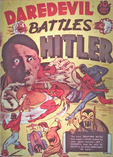
Knowing that Hitler and the wartime effort were huge circulation builders, America's comic book publishers rarely missed a chance to direct their super (and non-super) heroes into the fray. From 1941 to 1945, deliberately vicious, almost non-human caricatures of Germans and Japanese people populated hundreds, if not thousands, of pages of American comic books. The altered collage-style comic book cover by Bob Wood (signed) that opens this posting is from Lev Gleason's Daredevil #1 (not by Cole, although it appears that some figures from his stories might have been pasted onto or copied into the cover), one the classic iconic anti-Hitler comics.


Because of their connections to Europe, many of the comic book makers of 1941 were a little ahead of the curve as far as American involvement in stopping Hitler. That first spectacular Hitler punch-out cover of Captain America #1 came out nine months before America entered the War.

Even though he had no European connections, Jack Cole, a Methodist from Pennsylvania, was among the many American cartoonists who created anti-Hitler comics months before the attack on Pearl Harbor in December, 1941. Caught in the wake of World War two, even a non-political person would have been galvanized into opinions and action.

Cole was one of the few healthy American cartoonists to escape the draft. One of his brothers, Bob Cole, was in the Coast Guard during WWII, though, as this newspaper clipping shows:

It seems reasonable to assume that Cole may have wanted to do his bit by integrating his own brand of anti- Hitler/Japan propaganda into his work as he remained safe -- if overworked --  on the American homesoil.

In an interview in Alter Ego #12, Quality editor and Cole's friend and neighbor, Gill Fox states that Cole was not political. Although he may not have discussed politics with his colleagues, Cole clearly had political opinions and social awareness. In a 1940 Mantoka story, Cole writes:

"Our American Indians, during the early days of the United States were robbed of land, possessions and homes by white man's treachery." 

The villain of this story is an exploitative mine owner. Keep in mind that Cole was born and raised in a mining town.

Cole's political views were simplistic but heartfelt, based more on a humanistic view of life than a political view.  Any reader familiar with his stories knows that he was an idealist. He was not afraid to paint the worst -- and best -- of people.

Cole was a man who raised himself up through the American system by his own talent and toil, and so he knew first-hand the meaning and promise of human potential. He clearly believed in the American system. Where New York born cartoonists like Simon and Kirby, and Will Eisner depicted slums and urban decay, Cole's cities looked like nice places to live, even if they were populated by bizarre criminals.

Despite his humanistic streak, and sympathetic views of the downtrodden, Cole's portrayals of Nazis and Japanese people are virulently racist. No more so than anybody else's of the time, however. In fact, his first treatments of Hitler and the Nazis are fairly light. We can look at Cole's treatments of Hitler, including some rare and previously unknown material for Lev Gleason's slick magazines, and see an evolution in his treatment of Hitler from harmless to heinous.

The first appearance of Hitler in Cole's work was in Silver Streak #2 (July, 1941), in "The Claw Double Crosses Hitler." In this story, Hitler has a two-panel appearance and is almost an object of sympathy, as absolutely evil Claw forces him into a pact:


In this story, Hitler is drawn almost heroically. More than likely, Cole's intent was not to exonerate a dictator, but rather to just make The Claw seem as evil as possible. No doubt Cole, like most of the world, had no idea he was playing with fire. Even the great Charlie Chaplin said later that he would not have made "The Great Dictator," if he had known the depths of the Hitler and Nazi Germany's horrible madness.

About 6 months later, Cole write and draws a story called "War Over Iceland!," in which a comically nutty Nazi commander uses Doc Wackey's crazy invention, the "atom-reversing machine," to turn people into candy. He then licks the frozen, candied humans and delights in their taste. Cole plays it more for laughs than horror, but his story shows he beginning to sense the evil horror in the world. The Nazi's invasion of Iceland, of course, echos the real life invasion into Poland.


Another six months pass, and in June 1942 (Police Comics #9), Cole portrays Hitler and the Nazis as being behind the crazy villain, "Hairy Arms." As Eel O'Brian, Plastic Man leads a gang of criminals into resistance against the Nazis, echoing the 1941 Warner Brothers vehicle starring Humphrey Bogart, "All Through the Night." In one of Cole's typically witty moments during this period, he has a crook yell out, "Nobody can take away our right to free speech and free cash!"


The gloves begin to come off in the next issue of Police Comics. Here's How Cole draws Hitler:


This drooling, despising, demonic portrayal from Police Comics #10 (July, 1942)  is part of a spectacular Plastic Man splash page that functions as stand-alone editorial cartoon about the power-crazed Axis machine:


The interior story is only marginally connected to this nightmarish image. This is unusual for Cole, who was an early master -- like Eisner and Jimmy Thompson--at using the splash page to set up the story that follows. It may be a sign of the increasing sense of urgency Cole and much of the country felt at this time. In fact, the diagonal shading strokes in the above splash suggest almost a curtain of darkness descending on the world.

However, this sort of drawing was not unusual in American comic book at the time. Consider this splash page from Quality's Smash #43:


Just three months after the Police #10 splash,, three strongly anti-Hitler cartoons by Jack Cole appeared in Picture Scoop Volume 1, Number 1 (Oct, 1942).

The magazine was one of several mainstream "slick" style publications published by Lev Gleason, the publisher of Charles' Biro's comic book Crime Does Not Pay. Gleason also hired Jack Cole in late 1939 to edit his comic book, Silver Streak (named after his new car), where Cole created The Claw, Sliver Streak, Daredevil, The Pirate Prince, and Dickie Dean - Boy Inventor.

By the time of Picture Scoop's publication, Jack Cole had left Lev Gleason, worked briefly for MLJ (Archie) and then moved over to Quality Comics. It's an interesting revelation in itself to see evidence that Cole still dabbled in freelance work during his years in the comic book industry.

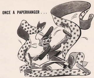
Many thanks to the sharp-eyed Darwination at Digital Comics Museum (and be sure to visit his  Darwination Scans blog ) who discovered these amazing cartoons, one of which is signed by Cole:


In these lively cartoons, Jack Cole has returned to using wash techniques, as he did with his Boy's Life cartoons, although his technique (and drawing) has improved greatly.  About 10 years later, he would publish numerous artful wash cartoons for the Abe Goodman Humorama magazines, among others.

Comics historian and publisher Greg Theakston has meticulously restored hundreds of Jack Cole drawings, and he made the observation, "the guy loved patterns." As has been previously pointed out many times in this blog, Cole used patterns as an art element time and again. Here, in these cartoons, we have the Swastika-patterned wallpaper. Just as the polka dots on Woozy Winks' green blouse catch and direct the eye, so do the patterns in these cartoons. These were illustrations for an article on how comedians were deflating Hitler. Here's the article:


I don't know about you, but for my money, Cole's cartoons are much more entertaining than the comedian's jokes, even the great Danny Kaye's!

Also in October, 1942, Cole's hero Midnight, goes to Hell and rallies the "inmates" there to go back to Earth and conquer the Nazis. Very similar to the Plastic Man story from Police Comics #9. It is clear now that Cole, like most of America, has accepted the necessity of fighting Germany and Japan.


Here's a Jack Cole one-pager from about a year later, in August of 1943, from Police Comics #21. Here, the emphasis is on the people who will lead us OUT of this mess, instead of the evil madman who created it.


There are numerous Jack Cole stories during the early 40's where his characters fight the Germans and Japanese, particularly his Death Patrol and Private Dogtag stories. 

In 1944, another Lev Gleason magazine appears, interestingly called True Drime Detective, foreshadowing Cole's 1947 True Crime Comics. As an aside, one wonders: could Jack Cole have designed that logo? Comics scholar Frank Young points out the top part of the logo is well done, but the bottom "Detective" part is sloppy and looks as if another -- lesser skilled -- artist added it on. Perhaps the magazine was going to be called "True Crime," but they added 'Detective" at the last minute, for some reason. In any case, the top part of the logo looks a little Cole-like to me, but we may never know for sure.


You can pick up a scan of the complete True Crime Detective Vol1#1 at the Darwination Scans blog (which has many other terrific items of interest). The back cover of this issue has a terrific lurid ad featuring Hitler that looks as if it could possibly be illustrated by Jack Cole. 


The sensibility, the staging and lighting, and the drawing suggest Cole to me. Look at the hand holding the dagger dripping blood, embellished with a human skull carving. The drawing is unsigned, and I haven't yet found any reference to it in any of the Cole literature. It's possible too, that other issues of True Crime Detective, as well as other Lev Gleason magazines may contain work by Jack Cole.

I'd love to hear from readers and fellow Jack Cole fans as to whether this ad appears to them to be drawn by Jack Cole.

These are just some of the instances of Jack Cole battling Hitler. Cole was by means a standout patriot in his anti-Hitler/Nazi/Japan propaganda, but he didn't remain silent, either. His comic book stories are filled with moral outage, so it's no surprise that Cole -- a generally non-political person -- would be moved to speak out against the madness that infected the world at the time.

After the war, Cole's work is less obviously topical, but it still kept in pace with the times. As America slid into the repressed, nightmarish, anxiety-ridden age of the Cold War and The Bomb, Cole's work -- like many comics and other vernacular artforms -- was a dark reflection of these changes.

SPECIAL ANNOUNCEMENT! 
My colleague, Frank Young (see his great blog on John Stanley here) and I have an article in Alter Ego #105, which has just been published. It's an examination of a bizarre Nazi horror story that was published before the Comics Code, and then re-published after the Code, with some absurd changes made to it. Many thanks to editor Roy Thomas and his team for doing such a great presentation and for using much of our original copy, untouched, which first appeared on our Comic Book Attic blog. The issue is a fascinating look at the effect of the Comics Code, and includes some eye-opening examples from Plastic Man, among others. The digital version is only $2.95, and you can download it instantly. Click on the image below to order!

Alter Ego 105 - Click Image to Close


All text copyright 2011 Paul Tumey


Nov 1, 2011

A New Unknown Jack Cole Cartoon Before Playboy


The "Unknown Jack Cole" goodies continue to come to light! Yes, your intrepid 'Cole miner,' has emerged from the dark, musty caverns of history into the sunlight with another sparking gem -- a wonderfully clever, forgotten Jack Cole cartoon published in a major mainstream American magazine.

With the discovery of Cole's previously unknown Millie and Terry comic strips, I theorized a few weeks ago that there could be several previously undiscovered Jack Cole cartoons published in 1954-55. This was the time that Cole was in transition from comic books to magazines, and it is now coming to light that he reached out to several markets in this transition, before settling in at Playboy, to become the magazine's first signature cartoonist.

We know about the "Jake" cartoons published in Martin Goodman's Humorama digests, and recently, comics historian and blogger Ger Apeldoorn (see his always fun and enlightening blog here) discovered a previously unknown Jack Cole cartoon in a 1955 issue of Look, a major US magazine at the time. I'm happy to announce and share yet another Cole discovery, this time from a 1954 issue of The Saturday Evening Post!


On February 12th 1954, this small, hastily written item appeared on the front page of the New Castle News, Jack Cole's hometown newspaper:


Many thanks to Alter Ego Magazine (recommended for anyone interested in comics history) for reprinting the article a few years ago ( I think it was provided to them by Jack's brother, Dick Cole). The article reads as follows:

"In the January 23 issue of the Saturday Evening Post you probably noticed an unusual cartoon of a house in which the picture told the story of someone going from floor to floor an turning on the lights.

"The artist's signature in the lower left hand corner was 'Jack Cole.'

"Jack Cole is a New Castle product, son of Mr. and Mrs. DeLace Cole, of 411 Euclid avenue (sic). His home is now in Milford, Conn., but presently he is here in New Castle, called here by the serious illness of his mother.

"Seventeen years ago Jack went to New York City with little more than a few sheets of paper and a burning ambition. His original ideas caught on fast and shortly he was drawing not one but two comic books monthly. (my note: this probably refers to Cole's Plastic Man and Midnight stories, which were the lead features in two comic books, but not the whole comic book, a distinction that was probably lost on the Pennsylvania newspaper writer). Between times, he turned out cartoons good enough for 'Judge' and Colliers. (sic) His first 'Satevepost' was Jan. 23.

He has abandoned the comic book field for free lance (sic) work and more and more his art will undoubtedly be seen in national magazines."

This tiny piece has some interesting information in it. It tells us that at the time that Cole's 16-year career in comic books was collapsing, his mother was probably dying. It must have been a time of great stress for Jack Cole. The article also fails to mention Plastic Man, the primary creation that, over fifty years later, Jack Cole is famous for having created. In all, the article is a nice snapshot of Jack Cole as he transitioned from comic books to magazines. 

Of course, the article also tell us very specifically where to find a Jack Cole cartoon in the pages of one of the top magazines of the day! Here then, is the delightful Jack Cole cartoon that appeared in the January 23, 1954 issue of The Saturday Evening Post, on page 125:


I love that the cartoon has a green outline to set it off in the dense page. This clever cartoon appeared amid spectacular lushly colored advertisements for modernistic new cars, plastic products, and articles about the cold war. The cartoon firmly places Cole's work in the context of 1950's "atomic age" America. The issue also had numerous cartoons, including several by Ted Key (of "Hazel" fame. The cartoon on the page opposite from Cole is by Cavalli, one of the ubiquitous career-cartoonists of the latter half of the 20th century. Amid all this professionalism, we find a little gem that gives us a glimpse into Jack Cole's life at the time.


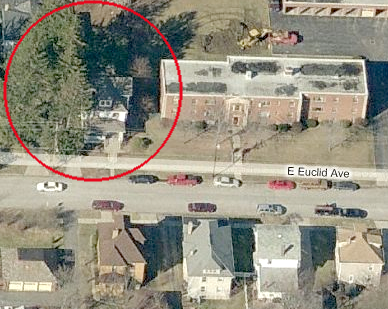
The 1954 newspaper article above gives us the address of Cole's parents, "411 Euclid Ave." The actual address was 411 East Euclid Avenue. In Jim Steranko's History of Comics Volume 2, he states that Cole's boyhood home was on Euclid Avenue. Therefore, unless the Coles relocated to another house on the same street, here's a satellite image of the house where Jack Cole grew up, as it stands today:


And here is a satellite photograph of the neighborhood where Jack Cole grew up, with the Cole home on Euclid Ave, circled:


Cole lived on the edge of town, almost to the end of the street, and was within walking distance of the large Oak Park Cemetery. One wonders if he explored the city graveyard and if that perhaps fueled his later comic book horror stories. Perhaps he pulled a prank or two there.

When Jack Cole lived in New Castle, it had a population of about 35,000 people. Today, the town has a smaller population, around 25,000. In Cole's day, New Castle hit the peak of its prosperity. In 1954, Cole may have seen a few changes upon his return to his hometown. Here's a photo of Castle Motors in the mid-fifties, a New Castle car dealership that stuffed their vehicles with appealing female radio and TV performers and drove them around town to attract attention:


Interestingly, New Castle is often referred to as a "little New York City," because of its diverse ethnicity. The town is famous in part for its chili dogs, which were developed by Greek immigrant restaurant-owners who lived there. Perhaps, in some ways, when Cole moved from New Castle to New York in 1936, he was already familiar with a city that has a diverse population.

It's difficult to tell for sure from the steep angle of the photo of the Cole home above, but the house appears to be very similar to the one in Cole's Saturday Evening Post cartoon. The Cole family, with six kids, would have needed a large house. Here is an image from a modern promotional film on New Castle real estate that shows the typical style of the town's residential architecture:


Again, very similar to Cole's cartoon:


Perhaps the comical incident Cole depicts in the cartoon actually occurred in his house. Perhaps he looked out from his bedroom window and saw lights going on and off in a house across the street. 

Years earlier, Cole put New Castle and some personal details into his comic book work. The first stories of his early 1939-40 comic book series, Dickie Dean (read the stories here), are set in New Castle. The character's name, no doubt, refers to Jack's brother, Dick Cole. Jack also used the pen name "Richard Bruce" for his 1940 comic book story, "Mantoka" (read it here). In the second Dickie Dean story, Cole writes,"Living in the small city of New Castle, PA is one who can truly be called "genius."


In his introduction to the 2007 collection of Cole's "Betsy and Me" comic strips, historian and author R.C. Harvey mentions that the "nimbus of genius" surrounds Cole's work. There's a bit of brilliance in the Saturday Evening Post cartoon. By no means the first -- or last -- to do so, Cole nonetheless combined sequential cartooning with gag cartooning. In effect, his Post cartoon is a one-page, 8-panel comic strip. 

However, while Cole's comic book one-pagers (and he created hundreds of these!) were stuffed with extra comic details, this cartoon is sparse. Knowing the cartoon would be published at a much smaller size than a comic book page, Cole simplified the image, stripping it of anything but the most essential details so that the repeated house images would read clearly at a postage stamp size. The high light and dark contrast of the house with lighted windows works perfectly for the format. The cartoon is a series of 8 almost identical images, and the key is to discover not only the differences between the images, but the pattern of increasing and then decreasing lights, as they are turned on and then off. 

We don't need to see the people inside to get the joke. In fact, it's considerably funnier if we don't see the people. This is very similar to how the comedy of Laurel and Hardy works. We see a shot of Stan with a ladder. We see a shot of Oliver bending over. We see a shot of Stan turning around with the ladder. We hear "Ohhh!" We see Ollie on the floor covered in paint.

Speaking of film comedy, when I first saw Jack Cole's Saturday Evening Post cartoon, I was reminded of a similar sequence in the amazing Jacques Tati film, "Mon Oncle," in which lighted windows in a silhouetted house react to noises. 


Tati's film came out four years after Cole's Post cartoon. Did Tati see the cartoon? Did Jack Cole influence Jacques Tati? Probably this is merely an instance of two comic geniuses arriving at a similar gag.

An essential part of the genius of Jack Cole's cartoons is how well form follows function, while still allowing for Cole's unique and personal voice. His drawings here are perfect for the medium and totally get the gag/story across.

I can picture the mature husband and wife in their pajamas in the upstairs bedroom. I can see the scornful look on the wife's face as she tells the husband who has just searched the house to see the source of the noise that he was just imagining things. I can see the slightly sheepish look on the husband's face. Not to make too much of it, but it seems to me this is ultimately is yet another Jack Cole cartoon about impotence. Heartbreaking, when you consider how magnificently gifted Cole was, and the courage and competence of his mid-fifties career change. Where many men might have found an safer but less artistic income source, Cole went for it -- and scored. It's admirable.

Here is the cartoon reorganized into a vertical strip, just for fun:


All text copyright 2011 Paul Tumey

Announcement! I've just finished the second Midnight eBook and it's on sale right now for $2.99! Look for it in the right-hand sidebar at the top! 
Related Posts Plugin for WordPress, Blogger...